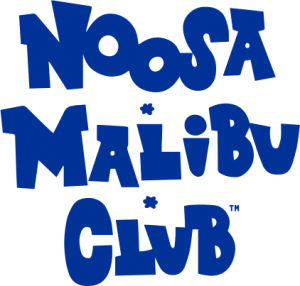
Festival announces iconic new logo
An iconic Festival needs an iconic logo. Those are the exact words organisers used to brief WeAreFlip, a Brisbane-based creative agency in charge of re-designing our Festival logo as the reputable event enters its 34th year in 2025.
After taking over management of the Festival in late 2018, World Surfaris Events wanted to announce their takeover with a new logo that highlighted the important of the Festival name and put a heavy emphasis on “Noosa’s” iconic location.
6 years later, it was time for a refresh. Powered by the sheer growth of this event over this time and the evolution of innovative ideas that have become a highlight of the great event. The logo captures the dynamic, organic shapes that form the iconic Noosa Heads landscape. With matching typography to create a vibrant and laid-back brand. The logo itself encapsulates Noosa itself – LAND | SEA | SKY.
We hope you like it!


